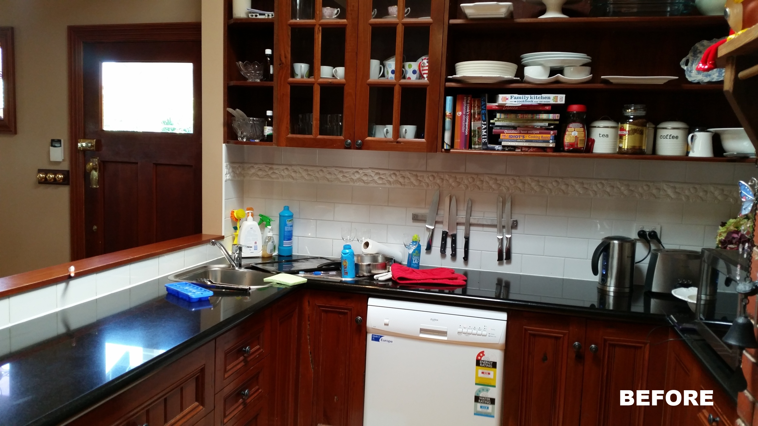
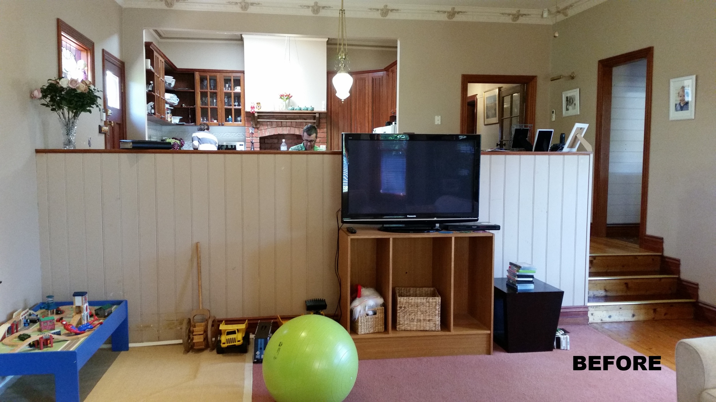
Visiting my clients home for the first time in the eastern suburbs of Melbourne, I was struck by two things: the poor use of space and the inappropriateness of the mock-Victorian decor that had been installed in the 90s. My brief was to breathe new life into the open plan kitchen, dining and living room to better suit their growing family. They wanted clean lines, more natural light, more efficient use of space, more storage, and a style that worked with a mix of contemporary and antique furniture.
The starting point for the interior design was to remove the false period detail, and return some ‘authenticity’ to the home which was built in the 1930s. The rooms were effectively stripped back to their shell, and new plaster and simple pressed metal ceiling panels installed. The original front windows of the house were used as the starting point for the joinery – the three panel window frame became the motif for the paneling of the overhead cupboards, entertainment unit and new kitchen window. These features reference the home’s heritage whilst enabling a more contemporary feel to be developed.
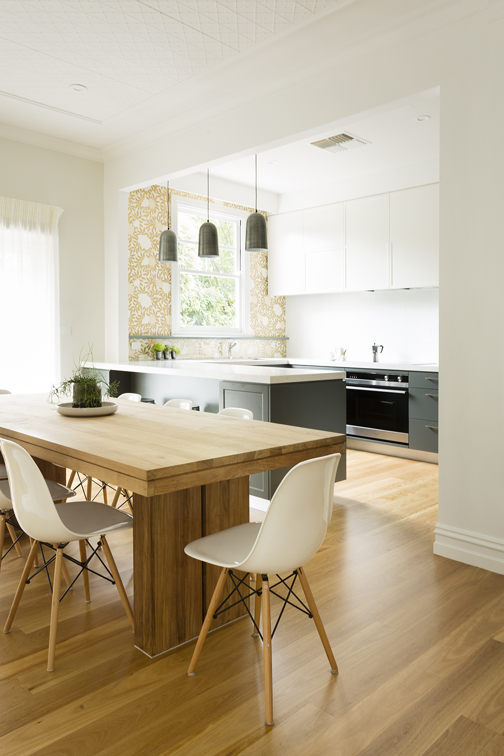
The new kitchen was the single biggest change to the space. Previously dark, dysfunctional, with very little storage, the new kitchen is the complete opposite. There is now extensive bench space and storage. Appliances have been integrated, and a pelmet added above the kitchen window to hide the blind and overhead lighting, ensuring the clean lines are maintained.
The aim of the colour palette throughout is to provide a contemporary but classic interior
design that integrates the kitchen with the living and dining room. The cooler tones of the cabinetry make the rooms appear larger and the gold tones of the wallpaper, along with the new timber floors, add warmth and interest back into the space. The wallpaper in the kitchen is protected by a glass splashback underneath the window ledge that continues across the wall. The wallpaper is used again on the semi-wall that separates the dining room and living room.
The new lounge furniture continues the colour theme with a particular emphasis on texture, which is seen in the lounge chair fabric, the fine detail of the sheer curtains and the inlaid carpet (used instead of a rug). Curtains have been used to disguise uneven window levels and to add a ‘dressed’ feel and warmth throughout the space.
A print and original painting by the talented artist Wendy McDonald feature in the living room. They add the finishing touches to the space (I am also the proud owner of one of Wendy’s paintings).
Considerable attention was paid to the lighting design. In the kitchen, warm white strip lighting is hidden underneath the pelmet, overhead cupboards and under the breakfast bench. The tulip lights over the breakfast bench are practical as well as adding charm to the scheme. The simple lines of the contemporary wall lights and ceiling pendants in the lounge and dining areas contribute to the calmness of the space.
We hope you enjoy the transformation as much as we did!


